
Introduction
In today’s fast-paced digital world, having a website that adapts well to various screen sizes is essential. With the rise of new devices—from foldable phones to smart TVs—responsive web design (RWD) is not just an option; it’s a must-have.
As we move into 2025, emerging technologies and evolving user behaviors are transforming how websites are designed. This blog explores the latest trends in responsive web design and how to leverage them to boost both user experience (UX) and SEO performance.
1. Mobile-First and Touch-Friendly Design
Mobile-first design is no longer a trend—it’s a necessity. Over 70% of all website traffic now comes from mobile devices, making it crucial for designers to prioritize mobile functionality from the outset.
Key practices for mobile-first design:
- Larger, touch-friendly buttons
- Prioritizing vertical scrolling for easier navigation
- Avoiding hover-only interactions that don’t work on mobile
- Quick-loading, lightweight elements
Moreover, touch gestures like swiping and tapping are incorporated into the design to align with native mobile behaviors, improving overall user experience.
2. Fluid Grids and Adaptive Layouts
Websites are shifting from fixed-width containers to fluid grids. This ensures content scales proportionally across all screen sizes. With the use of CSS Grid and Flexbox, layouts now adapt seamlessly, regardless of device or screen size.
Why it’s important:
- It provides a consistent experience across all devices.
- It future-proofs your website as new devices are released.
- It reduces the time needed for developers to build responsive sites.
By using advanced CSS techniques like min(), max(), and clamp(), developers have more control over responsive typography and spacing, ensuring a balanced design across any screen.
3. AI-Driven Personalization
Responsive design is evolving from simple layout changes to context-aware customization. In 2025, AI tools are integrated into websites, adjusting content based on factors like:
- Device type
- User location
- Browsing history
- Time of day
For instance, an e-commerce website may feature different products on mobile vs. desktop, enhancing the user experience. Moreover, AI tools continuously test different layouts and calls to action (CTAs) in real-time, helping businesses optimize their designs for each user.
4. Dark Mode and Theme Switching
Dark mode continues to rise in popularity, and it’s now a standard in responsive web design. Websites are adopting automatic theme switching, adjusting based on system preferences or user selection.
Why dark mode matters:
- Reduces eye strain, particularly in low-light environments.
- Saves battery on OLED screens.
- Offers a sleek, modern aesthetic that many users prefer.
By utilizing the CSS prefers-color-scheme media query, developers can offer both light and dark themes for a seamless user experience.
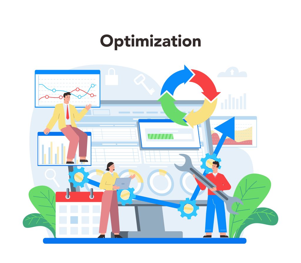
5. Performance Optimization and Core Web Vitals
Performance continues to be a key factor in SEO rankings. Google’s Core Web Vitals still play a critical role in how websites are ranked, and responsive design must support fast-loading, high-performance sites.
Optimization strategies include:
- Responsive images using
srcset, which adjusts images for different device resolutions. - Lazy loading for off-screen images and videos to improve loading times.
- Preloading important resources like fonts and critical CSS.
- Reducing third-party scripts that can slow down your site.
A responsive website that loads in under 2.5 seconds and ensures stable layout shifts will not only retain visitors but also improve SEO rankings.
Conclusion
Responsive web design in 2025 is about more than just fitting a layout to different screen sizes. It’s about creating a seamless, personalized, and fast experience that works across all devices. As technology and user expectations continue to evolve, embracing these trends will ensure your website delivers an outstanding experience—whether on a mobile phone, tablet, or desktop.
Stay proactive with these trends, test regularly across devices, and put the user experience first to stay ahead of the competition.

